I feel like the strongest part of my work was the tattoo design itself since i really didn't use any reference for the tattoo and i think the idea of the tattoo was really good. I feel like me taking pictures should be improved on since there's a bit of yellow light and the photo is a little blurry, so next time i should take the picture outside to get natural light.
The easiest part of the project was drawing the photo since i really love to draw so it wasn't any type of challenge for me to come up with a tattoo design. The most difficult part was getting the drawing to blend in with the skin and getting it to morph and move with the skin so it looked realistic.
I used to magic wand to remove all whites in the picture and then used the multiply blend mode to make the tattoo kind of blend into the skin. I used the warp tool to bend and push the tattoo so it matches the curves in the body and on the sides of the body. I used the eraser to erase anything that was hanging off of the body. I used the blur tool to blur the edges of the drawing so the blend into the skin easier. I used the dodge tool to highlight the tattoo where the skin is highlighted, and used the burn tool to darken the tattoo wherever the skin is darkened.
I demonstrated the by being able to use the tool enlisted to Photoshop a tattoo onto someone to make it look real. If i could do this activity differently I would pick a different design because after finishing i had ideas for cooler tattoos that i was sad i couldn't do. I would also have the person make a pose to just not have the picture seem boring with just a tattoo sitting there.
Thursday, December 15, 2016
Tuesday, December 13, 2016
Friday, November 18, 2016
Self Portrait Reflection
I felt like the strongest part of my piece was the color composition because of how the objects matched the color of whatever section they were in and it all came together to make a rainbow of things that described me. The part i think i could've worked on more was the fact of having my objects look like they're interacting with each other because although some were on top of each other and not just messily pasted on top, i felt like i could've done better in that aspect.
It was really easy actually finding the pictures because i know myself a lot and the things i like so i had way more than 13 things to actually choose from but didn't want to overwhelm myself.The difficult part however, was changing the pictures to avoid copyright infringement. I didn't want to butcher the picture so much that the object and or character was unidentifiable, but i think i did an okay job of adding oil pant filters and color filters enough to where I changed the picture without it infringing on anything.
I used the move tool to move my pictures around and position them the way i wanted to. I used the crop and various lasso tools to pick and piece different parts of photos to separate them. i also used the shape tool to separate the colored sections i have, then lowered the opacity on them so they made the objects under it their color. One last one i used was the filter and colorizing. This was so i could distort and change my photo enough so they didn't infringe on anything. I demonstrated the goal by making a vibrate and colorful picture that shows my personality and what type of person i am, which is an outgoing and expressive one. If i could do this project differently though, I would choose picture that could describe me, but also can interact with each other if i were to put them together.
Wednesday, November 16, 2016
Wednesday, November 2, 2016
Tuesday, October 25, 2016
Wednesday, October 19, 2016
Clone Wars: Reflection
I think my strongest point of my work is where i placed the clones and how i had each of them interacting with each other in creative ways. One area that could be improved is the way i colored in the clones, which some are a bit jagged on their outlines and two are fuzzy on their head. The easiest thing about the project was coloring in the clones, since i had already lined all the photos up most of it was a piece of cake. The most difficult part was lining up the photos because they had to be so precise and perfectly lined up in order for you to even start doing anything, and the way some photos were taken made it very difficult to line up.
I used the move tool to move and resize my pictures and to line them up while using to opacity tool to see if i had lined them up properly.once i did that i made a layer mask and started to use the brush tool to paint in one clone on one layer onto the other. I demonstrated the goal by creating more than five clones interacting with each other in different and creative ways. If i could do this differently however, i would make the clones interact with each other in more of a dynamic way like fighting or playing basketball on a court maybe.
I used the move tool to move and resize my pictures and to line them up while using to opacity tool to see if i had lined them up properly.once i did that i made a layer mask and started to use the brush tool to paint in one clone on one layer onto the other. I demonstrated the goal by creating more than five clones interacting with each other in different and creative ways. If i could do this differently however, i would make the clones interact with each other in more of a dynamic way like fighting or playing basketball on a court maybe.
Monday, October 17, 2016
Tuesday, October 11, 2016
Tuesday, October 4, 2016
Art Reflection
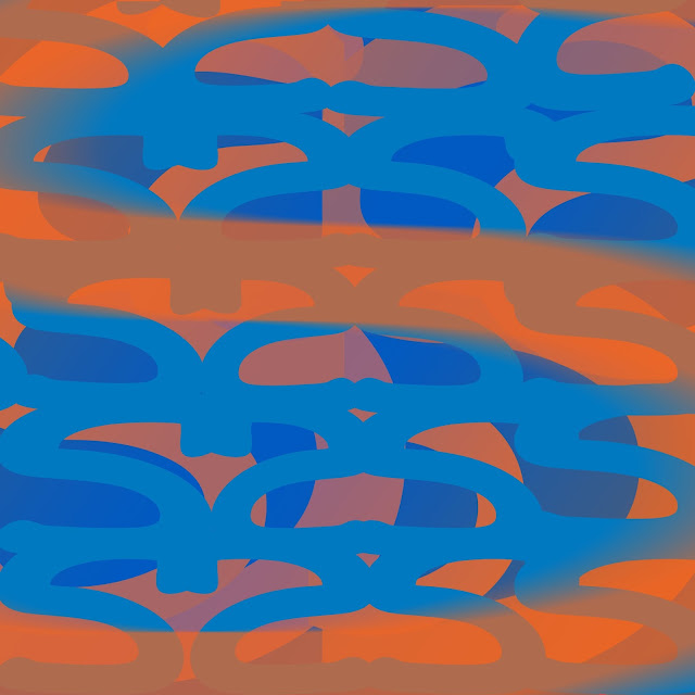
I think the strongest area of my work was the use of contrasting colors, i used orange and blue which are complementary colors and they go together very well. One thing i think could be improved is the composition/patter of the letters, i should've tried other cool and interesting patterns. I also could have used more colors other than blue and orange to make the piece really pop.
The thing that was easy about this activity was that i was only working with one letter so it wasn't very complicated to move and mix around the letters in a design. Having background knowledge on some of the tools helped too and made this very easy to be creative. What was difficult about this activity was the fact that i had to make my own pattern/design. I draw a lot but designs aren't really in my range cause i'm not very creative with them. Even though i knew how to use these tools they were a bit finicky and i messed up a couple times with layering the letters.
I used the transform tool to shrink and expand my letters, then i used the move tool to move them into place as i wish, For the biggest S on the screen i used the blur tool to give it a moving and blurry effect and put it on the top layer. I used the gradient tool to kind of give all the letters a filter and layered in on top of anything else. I demonstrated it by being able to make a contrasting pattern by only using one letter but using th tools to change it and make it unique. I would definitely do this project again if i had the chance, though i would want to learn about more tools in Photoshop before i do so maybe i can add something new that wasn't in the first one like a more interesting pattern that's beautiful to stare at or a unusual color that may pop when on top of the two i already used.
Monday, September 26, 2016
Subscribe to:
Posts (Atom)


